


I was in New York a couple of weeks ago and happened to notice that the Museum of the City of New York had just opened an exhibition on graphic designer Paul Rand, which will be on view through July 19, 2015. Curated by Donald Albrecht, Everything Is Design: The Work of Paul Rand features more than 150 advertisements, posters, corporate brochures and books designed by Rand, of whom Saul Bass said, he had “watched him like a hawk.” Both became prominent representatives of European modernist design for corporate America, Rand creating the identity campaign for IBM and Westinghouse, Bass for AT&T and ALCOA. Following up on my book, Saul Bass: Anatomy of Film Design, I wanted to see whether Bass really had “stolen” from Rand, as the older designer suspected.
Born on August 15, 1914 in Brooklyn as Peretz Rosenbaum, Rand shared with Bass his Eastern European Jewish heritage, birthplace, and the fact that both attended the Art Students League in the mid-1930s. Rand’s teacher 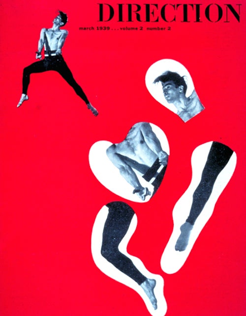 there was the German exile artist George Grosz, while Bass studied with Howard Trafton, three years later. Six years Bass’ senior, Rand had previously studied at the Pratt Institute and the Parsons School of Design, unlike Bass, who was more or less an autodidact, starting work for a motion picture advertising company at 16. Bass and Rand probably did not meet at the League, but certainly knew of each other through the New York Chapter of the Art Directors Club by the time Rand published his influential book on design, Thoughts on Design (1947). Given the fact that in the 1930s American design was still an exclusive club, dominated by Madison Avenue WASPs, Rand chose to change his ethnically marked name, while Bass did not.
In mentally comparing Rand’s design work on display in the exhibit to that of Bass, it seems evident that Rand was less tied to a rigorous design geometry, even while basing his designs on an x and y grid, and at the same time more representational in his illustrations. Rand’s designs for publications, e.g. his cover for a book on Dada, The Dada Painters and Poets: An Anthology (1951), or his Direction (1938-50) and Flair (1950) magazine designs, are characterized by modernist abstraction. Many designs also feature strong diagonal elements, whereas Bass avoided them like the plague. Rand incorporated photographic images of products into his advertising, while Bass usually abstracted such product images. Rand also tended to put more text in and around images in his advertising than Bass, who preferred logo-like designs rather than crowded typographies.
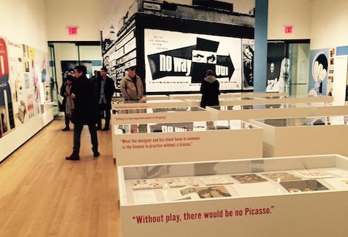
However, the main difference between the two designers was that, while Bass came out of the film industry and 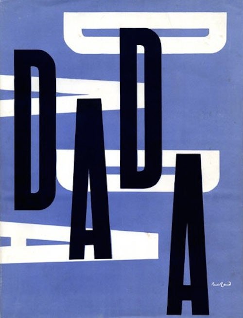 would become most famous as a film designer for publicity, titles and his own films and commercials, Rand worked almost exclusively for Madison Avenue clients. According to this Paul Rand website, he only designed a single poster for the early Sidney Poitier film, No Way Out (1950). The poster, which has often been mistaken for a Saul Bass design, is reproduced in the exhibition at the City Museum, in addition to the movie lobby card, which was designed by Erik Nitsche (mislabeled as a work of Rand’s). The advertising campaign for the same film was, on the other hand, designed by Saul Bass.
There were at least three design elements I noticed in Rand’s work, which would later become signature designs in Saul Bass’s canon. A cover of Direction magazine from 1939 features disembodied body parts, laid out in a manner reminiscent of Bass’s Anatomy of a Murder (dir. Otto Preminger, 1959) film credits. A book cover design for Nicholas Monsarrat’s novel, Leave Cancelled (1945), uses bullet/punch holes as a symbol for war, just as Bass would use them for his advertisements for Attack! (dir. Robert Aldrich, 1956) and film credits and premiere invitation for The Pride and the Passion (dir. Stanley Kramer, 1957). A Disney Hat advertisement (ca. 1946), which breaks an image into four equal parts, recalls Bass’s strategy to signify trauma by breaking up an image into unequal parts, as in his advertisements for The Death of a Salesman (dir. László Benedek, 1951). These similarities merely indicate that Bass was watching Rand and occasionally borrowing fragments of ideas to create his wholly original design work for American movie companies.
< Back to Archival Spaces blog